Namco Bandai surprised everyone with the release of the "Retro" trailer (plus two "B-roll" videos and new screenshots) on August 18. "Retro" showcases several classic Splatterhouse moments, and how the development team reimagined them for the new game. As you can imagine, this trailer was greeted with incredible enthusiasm from the fanbase. If you haven't seen it yet, go check it out here. Pay attention to the music too, as it sounds like something you might hear in the original games. Appropiate, yes? Also, check out the two "B-roll" videos here and here.
Just as I did with "Blood Thrash" and "Make A Wish", I've gone through the trailer and grabbed several very interesting screenshots. I didn't bother with the classic stuff, because hey - we all already know what those games look like. It has been commented upon that the classic parts of the trailer look extra crisp and detailed, leading some to believe it's footage taken of the emulated versions of the games that are being included as unlockables. I see no reason to believe otherwise, personally.
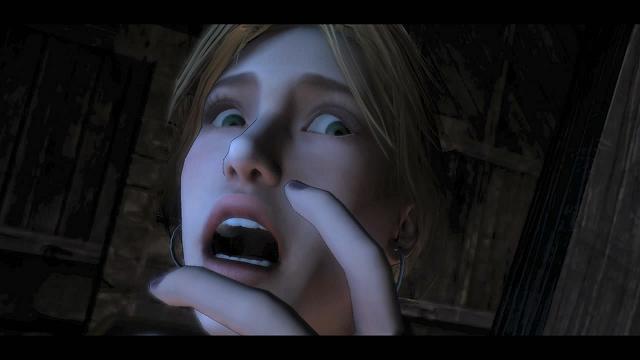
As a nod to the opening of Splatterhouse 2, here's a shot of Jen. Not pictured: Rick and the Mask, which follows this (and is echoed in the trailer by the opening of the arcade game).
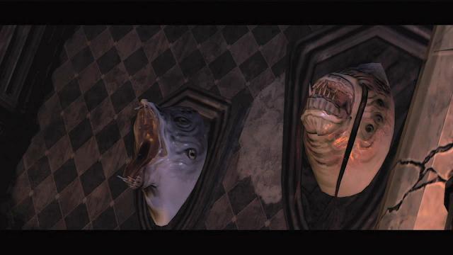
Here's these trophies again, laughing. A subtle nod to the laughing deer head trophy in the fire room of Splatterhouse: Wanpaku Graffiti (which in itself was a tribute to the laughing deer head trophy in Evil Dead 2: Dead By Dawn)?
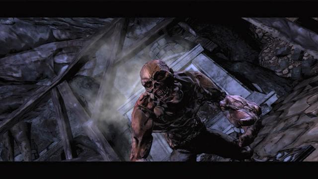
...and hello new guy. Kinda muscled for a zombie, don't you think? I wonder what his deal is.
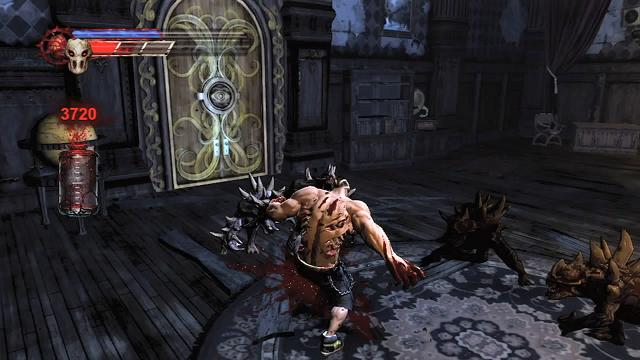
Here's our first look at the revamped HUD. I'm guessing one of those is the blood meter, possibly the red bar next to the Mask icon. The blue one next to the heart icon may be a regeneration meter, and the bottle may be used to see how much blood you're gathering in one area, or something like that. Also of interest is the door. I wonder what's up with the eyeball design? You also can get another look at the kind of damage Rick is taking.
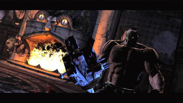
Now that's one creepy looking fireplace. As seen in one of the "B-roll" videos, the fire dies down long enough for the horned creatures to charge out. What with the placement of the clocks and horned animal face, it gives the illusion of a face. Also here you can get a good look at the new, improved 2x4.
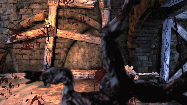
The wall-splat in action! Also glimpsed briefly in one of the "B-roll" videos is Rick splatting a Deadman into the wall on the other side, something that I've been hoping to see.
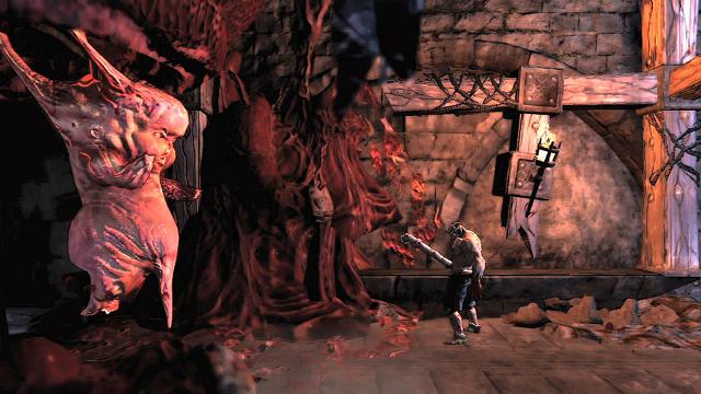
The return of the mutant fetuses, everyone. I fought four of these during the demo I played in Worcester, but didn't mention them because at the time, their existence wasn't public knowledge. However, the ones I fought were in the 3D stage. Until now, I had no idea there would be any in the 2D stages. Also shown in one of the "B-roll" videos: these things apparently attack by taking a dump on Rick. Seriously.
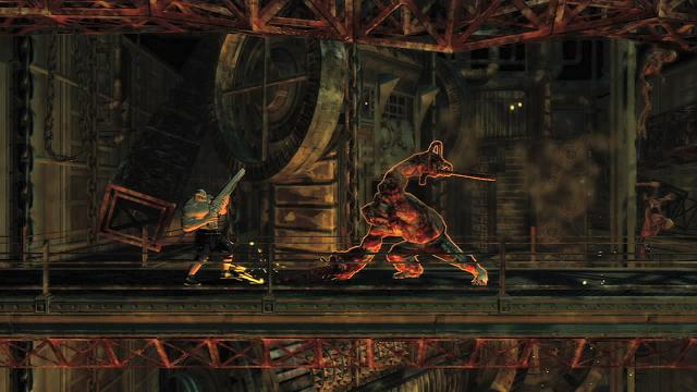
2. D. BIGGY. MAN. FIGHT. I'm not sure what else I can say here. Until this showed up, I thought for sure that fight would strictly be in 3D.
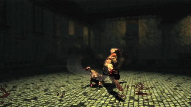
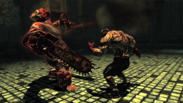
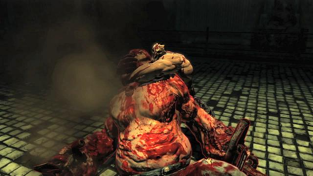
Here's some pictures of the 3D fight. I'm wondering what the glowing outline around Biggy (as well as some other characters) is at one point. Some kind of targeting system in action, perhaps?
An aside: a comment was made about Biggy, namely that this fight makes him look like "a fat, slow, lumbering pushover," due to his lack of speed compared to the original Biggy Man fight from Splatterhouse. I have a different line of thought about that; namely that the mechanics of the game have changed. Unlike Splatterhouse, where you could last a while against Biggy thanks to your life meter, you face the threat of instant death by decapitation while facing Biggy. He's easily one of the most dangerous enemies in the game because of this. Perhaps he was slowed down to give you more of a fighting chance to beat him. Think about it. If this Biggy could do what the original could, it might suck all the fun out of the game due to the numerous instant deaths you'd be bound to suffer.
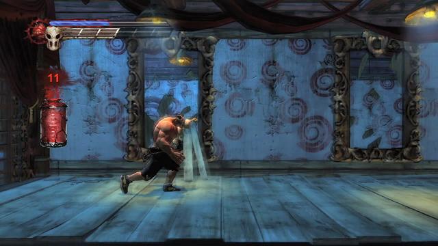
Hmmm. A hall of mirrors. I think you all know what this means.
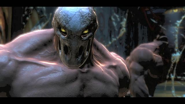
Nah, nothing out of the ordinary here.
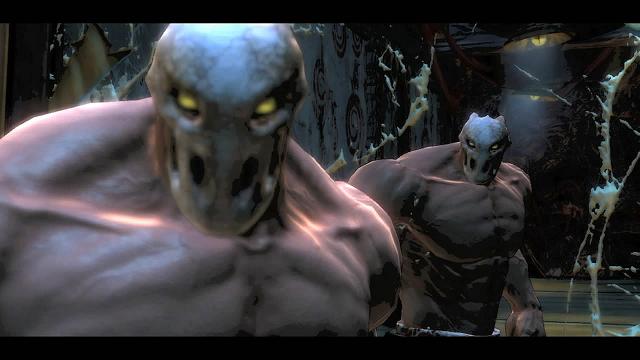
WRONG! I can't tell you how much I love that reveal. Yes, Mirror Rick is back!
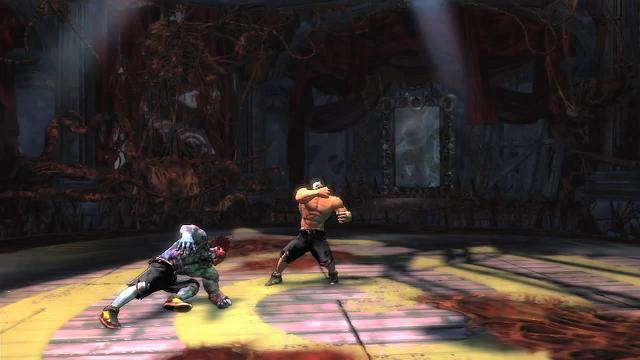
As you can see, during the fight Mirror Rick is colored a bit differently than Rick, not only as a nod to the original, but so you don't get confused (which I'm guessing is why the original was colored differently as well). But take a good look at Mirror Rick here; specifically, his mask. Yes, that is a deliberate homage to the Turbografx-16 version. The red mask is now officially part of Splatterhouse canon.
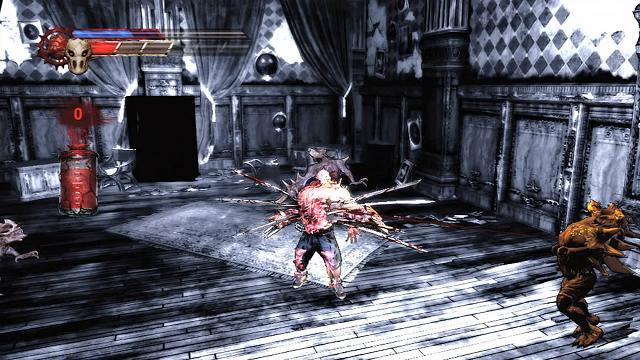
Here's another look at the revamp of Mutant Rick's chest-bursting move from Splatterhouse 3. I really can't decide which one looks more painful.
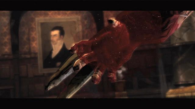
A closeup of Rick growing his "Wolverine claws." As if he hasn't lost enough blood already, there goes even more. I wonder who that is in the painting?
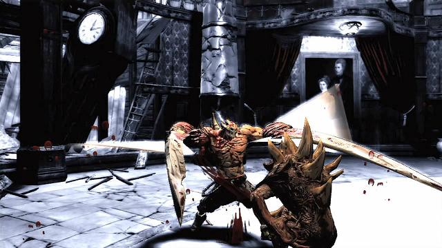
Rick looks more monstrous than ever at this stage of his mutation. And y'know, all I can think of when I see this shot is how much fun it's going to be to tear through the monsters when he's in this state. Also, note the portrait on the wall. Dr. West and his wife, perhaps?
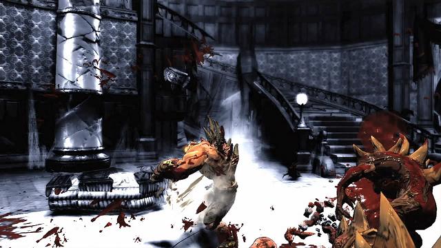
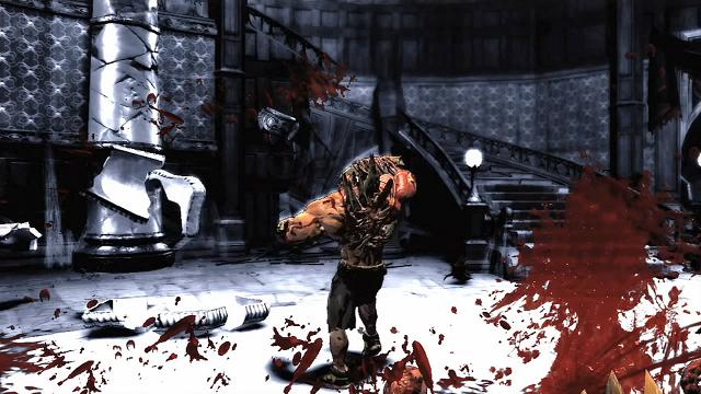
Yet another look at Rick's mutation, and proof that at least some objects in the game can be destroyed: that coffin shattered when Rick hit it.
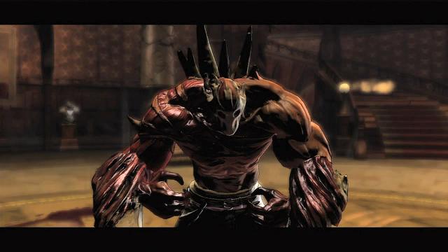
"JENNY!"
I hope you enjoyed this deconstruction of "Retro". As we move even closer toward the release of the game, keep checking back on either West Mansion or The Third Moon (the official West Mansion forum) for all the latest Splatterhouse news!
